Did you notice? Our link and button colors have changed at esource.com!
Accessibility has been an ongoing goal here at E Source, and our efforts over the years have ranged from writing in plain language to including detailed alt text for screen-reading technologies. The design team is excited to continue that effort with this visible change to the color contrast of our links and buttons. We’re following the Web Content Accessibility Guidelines (WCAG) wherever possible, and one of the things those guidelines point out is that text and buttons become much easier to read when the contrast ratio between the foreground and background is higher. People with visual impairments especially benefit from this rule.
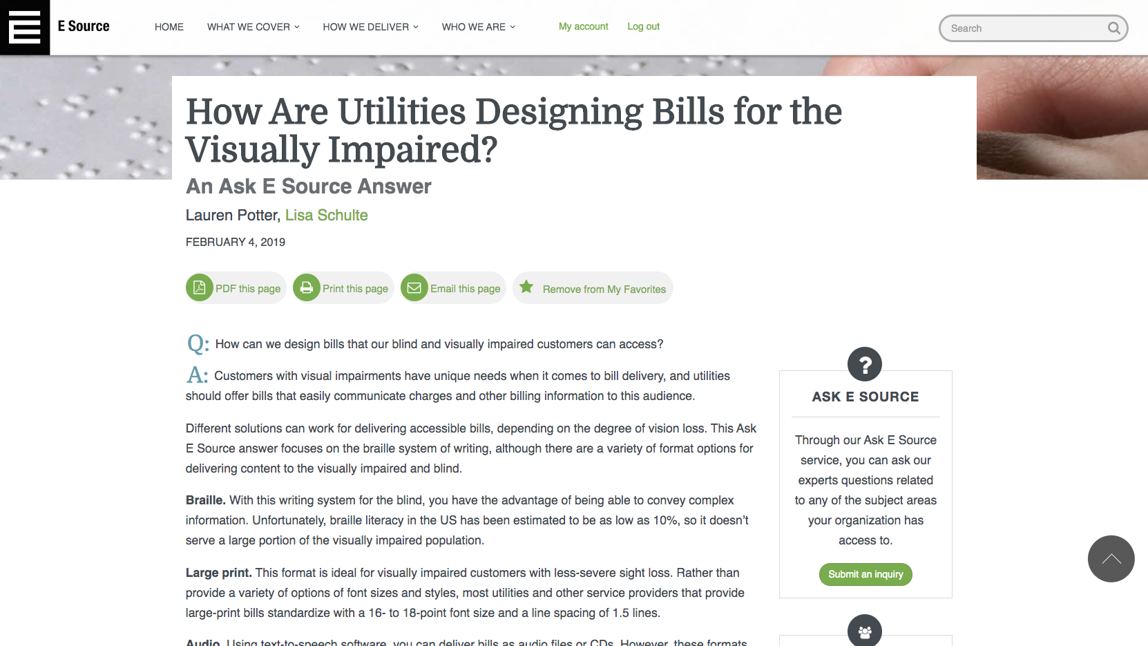
We love our E Source green, but as a text link color against a white background, it falls short with a contrast ratio of only 2.7:1.0 (figure 1)—WCAG recommends a ratio of at least 3.0:1.0.
Figure 1: Old link and button color
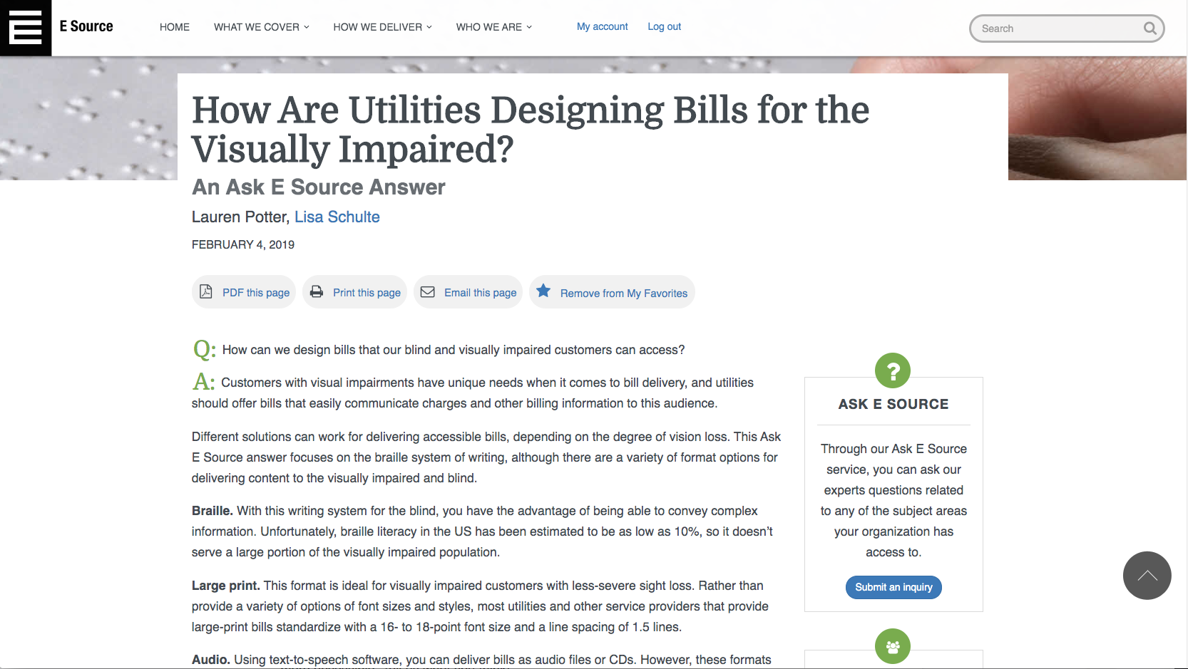
Our design team solved this issue by using our other favorite E Source color, blue, which gives a healthy ratio of 4.5:1.0 (figure 2).
Figure 2: New link and button color
But we still wanted our E Source green to have a presence on our site, so going forward, we’ll use it for decorative elements that aren't essential to readability, including icons, sidebar borders, and large pull quotes.
This change might seem small, but it’s the start of something bigger. We’ll continue to make changes to our website so it’s more accessible to all our members, and we hope you follow along as we go. Tell us what you think!